Mixe. Store
Mixe. Store (pronounced Mix Store) is an online e-commerce store selling South-Asian groceries in Europe under the Mixe.Corp group. The brand would function all across Europe, home-delivering south asian groceries to consumers
Client: Mixe.Corp
Scope: Branding, Poster Design, Social Media
Year: 2020
Read Time: 3 minutes


The client wanted a brand identity that wouldn't limit itself to just groceries, keeping in mind future expansions into other fields. They also wanted the identity to showcase innovation and growth and have their audience instantly connect the brand to Europe.
There were multiple levels to be thought about while designing this brand identity. How do you get the audience to read the word right, ie, pronounce the brand as 'mix' and not 'my-xe' which was a commonly observed area of doubt amongst people who looked at the name for the first time? How do we make a logo that pays homage to its european roots and markets? How do you create an identity that represents growth and innovation while still having a strong visual presence that can be applied and expanded to fit multiple industries and products in the future?
I began by looking at all the european flags together...


I looked at all the flags together and picked out the most distinct colours that stood out throughout all these flags. I wanted to chosen colours to immediately create a mental connect with Europe when looked at, especially amongst people living in Europe. After tweaking the hues and intensity of the colours a little more to ensure that they maintain the best legibility when placed on most colours, the 3 shown alongside were finalized.
I then began to think about how to ensure that the word was pronounced correctly, that people understood that the 'e' in the word 'mixe' was silent. I played around with multiple options that would highlight the letters 'M', 'I,' and 'X' over the 'E' or create a distinction between the first 3 letters and the 4th letter so that the first three letters would be read together, automatically reading as 'Mix'.
I then also began to look different ways to incorporate growth into the logo. After multiple explorations in type and form, the final logo was as follows.


Visit mixe.store here
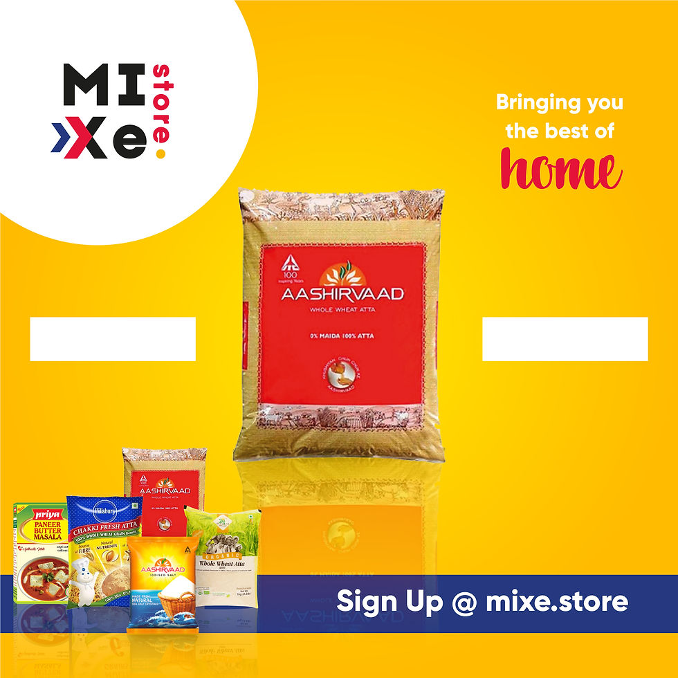
The two arrows were used to depict growth and advancement, and the colours red, blue and yellow were chosen as they were the most repetitive colours amongst most European flags. And as a period denotes the end of a sentence, a similar element was added here as well to denote the end of the hunt for South Asian groceries, describing mixe store as a one-stop solution for all your grocery needs.
MIXE was also stylized as MIXe to ensure that tthe brand is pronounced correctly as mix and not mix-e, as was observed as a common issue.
