Orchard Press
Orchard Press is a Pune-based start up that was coming out with a line of luxury, organic, cold-pressed cooking oils. Branding and Packaging was to be designed for Orchard Press and its' different varieties of oils respectively.
Client: Aranyaka Lifestyles
Scope: Branding, Packaging, Publication Design
Year: 2018
Read Time: 3 minutes


The Orchard Press was launching 5 new types of organic, cold-pressed oils - Safflower, Flaxseed, Coconut, Groundnut and Olive Oils, and needed packaging designed for the same.
The initial packaging concept consisted of dark coloured bottles with different coloured labels for each variety of oils for easy distinction between the different kinds. The colours of the labels were chosen to represent the colour of the flowers of the plant used to make each respective oil. For example: the Safflower plant has bright orange flowers, hence the label for safflower oil was designed to be a bright orange as well. Dark coloured bottles further help maintaining the freshness of the oil for longer durations of time as light tends to degrade its’ quality. The black also helped in building a premium feel for the product.
All the labels incorporated illustrations of the respective plant in a vintage style to add an unadulterated, and luxurious feel to the packaging. The illustrations were first designed and hand-drawn on paper and later digitized and incorporated into the designs.

The Orchard Press logo was designed to depict 3 main aspects of the brand and product range:
1. Product for the premium market
2. Cooking oils
3. Natural, Cold-Pressed Oil that come to you unadulterated
This was depicted through the logo below. The drop of oil falling from the branch of the plant represents the purity of the oils - the straight from nature aspect of it. The gold and the texture together were used to represent a luxury feel, while maintaining a slight rustic charm to the identity. This further helped with the messaging that the brand believed in providing products that were unadulterated, and true to their origins.


To check out Orchard Press, click here


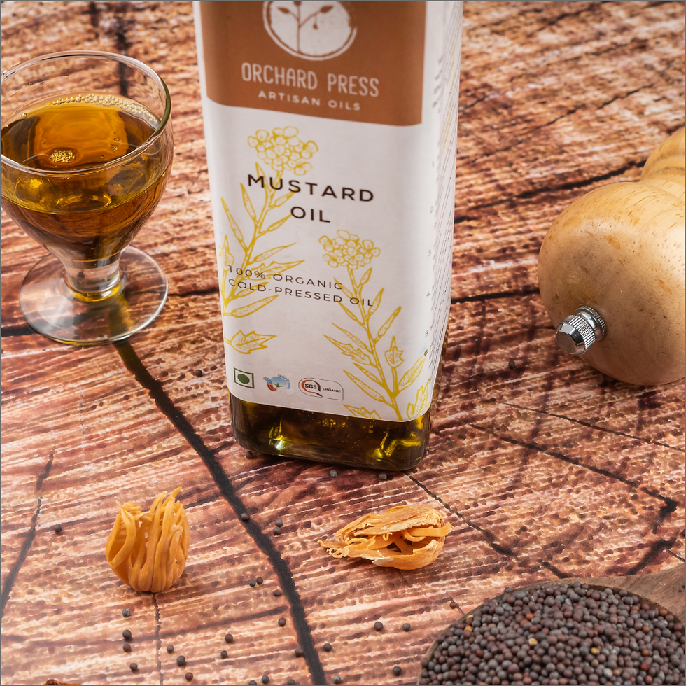
Due to manufacturing constraints, the brand decided to go ahead with clear bottles for the first phase of products instead of black bottles. This caused a problem - how would these colourful labels look against the yellow oils in clear glass bottles. It was decided that the some of the labels would not create sufficient contrast against the oil-filled bottles and this would impact the visibility and premium aesthetics of the labels. Also, with the transparent bottles, the common branding element (ie. The black coloured bottles with coloured labels in the proposed version) was now missing. The bottles would now appear in the colours of the oils within, and each variety of oil was slightly different in colour thus maintaining no consistency in that regard. Keeping all this mind, for the first phase of the product, it was decided to make the labels white with the illustrations on them in the chosen colours as shown below.


The brand also required a simple product catalogue as a part of their initial marketing plan. The catalogue would be sent out to various distributors, displayed and stores for consumers, and exhibited at food expos. The main purpose of the catalogue was to introduce the brand, and talk about the different varieties of oils and their individual health benefits.


